Herbert Matter

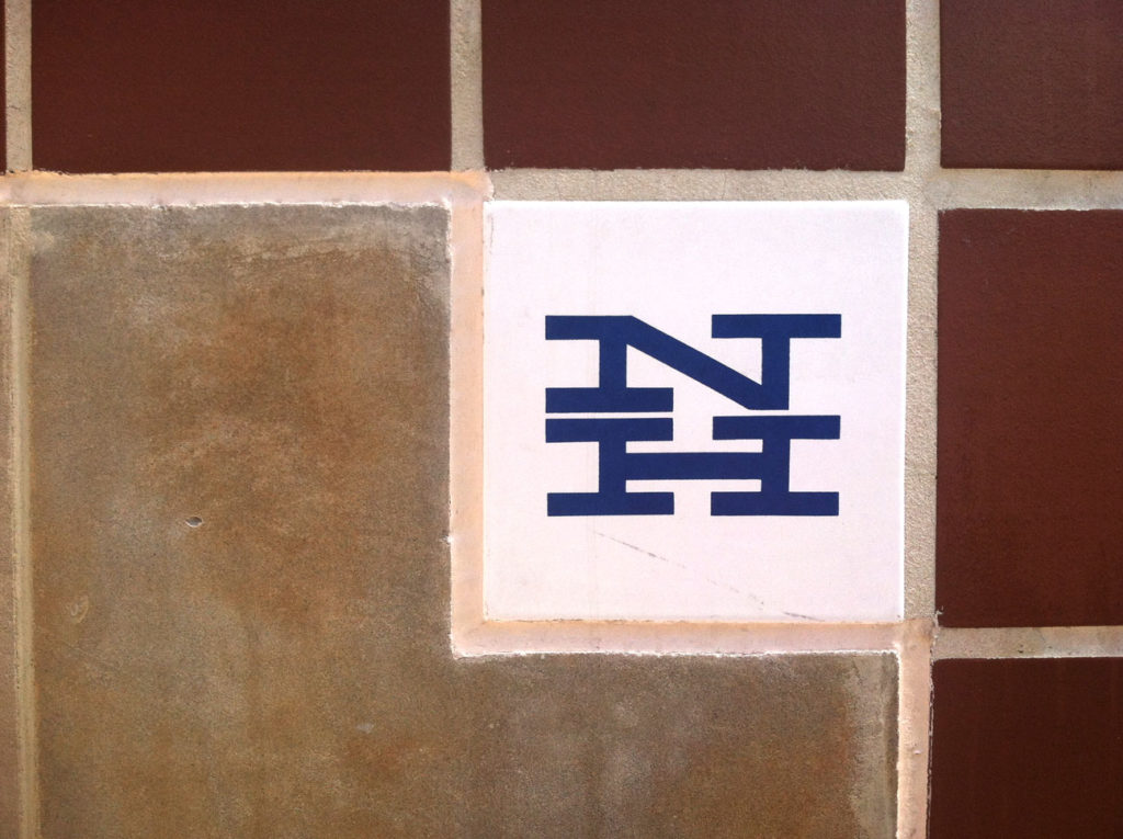
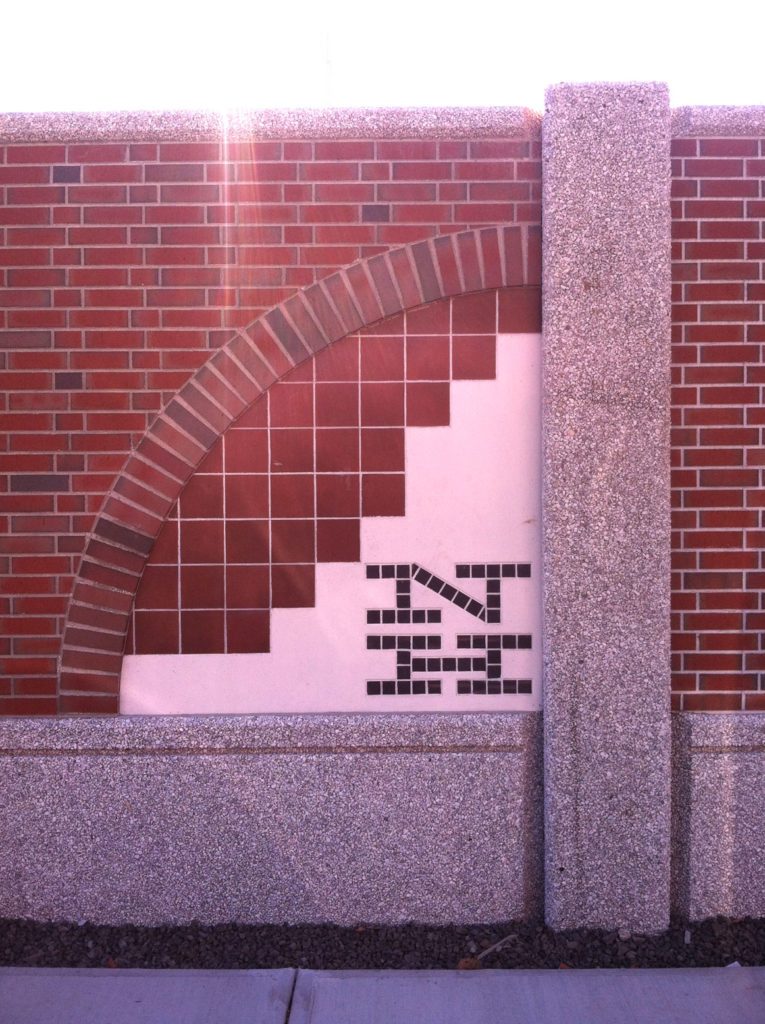
Have you guys ever noticed this logo around the Union Station in New Haven?
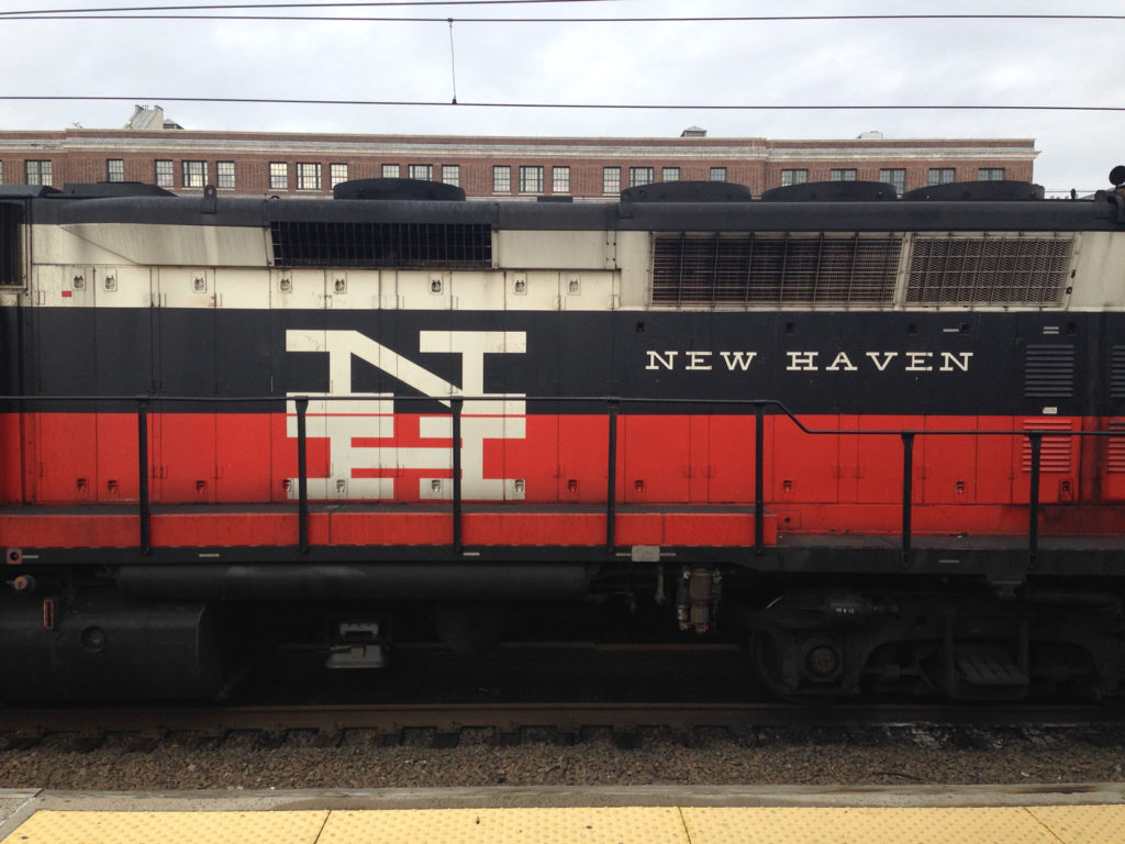
Well, seeing these photos of mine all taken at different times over the years, you can probably tell that I certainly have paid special attention to this. 🙂

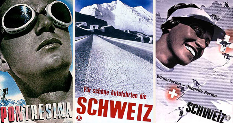
For those of you who ever wondered what it is and who designed it: it’s a logo for New Haven Rail Road, designed in 1952–1955 by Herbert Matter(1907–1984), who also taught design and photography at Yale from 1952 to 1976. (He had worked as a photographer for magazines such as Harper’s Bazaar and Vogue). You actually have seen his posters for the Swiss Tourist Office from one of my presentations. Do you recognize these?
There is a documentary film about Matter, The Visual Language of Herbert Matter, which I sometimes show in class. Watch the trailer:

Obviously we couldn’t do this together semester, but good news! I found a way for you to watch it. Kanopy has this film in their collection, and you can access their entire collection with your Yale credentials. The only thing is that you’ll need to download and install VPN from Yale software library which can be a little bit of work. But I think it is worth it, especially seeing the vast collection Kanopy has. There are more design documentaries and other films I will recommend from there! There is so much we can watch together.

And now next time you walk by this logo, you’ll know the backstory!

More about Herbert Matter: herbertmatter.org
Herb Lubalin

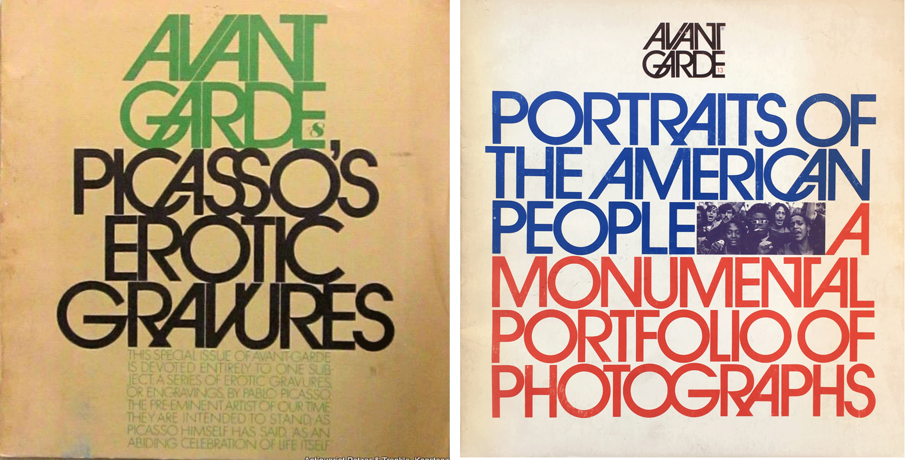
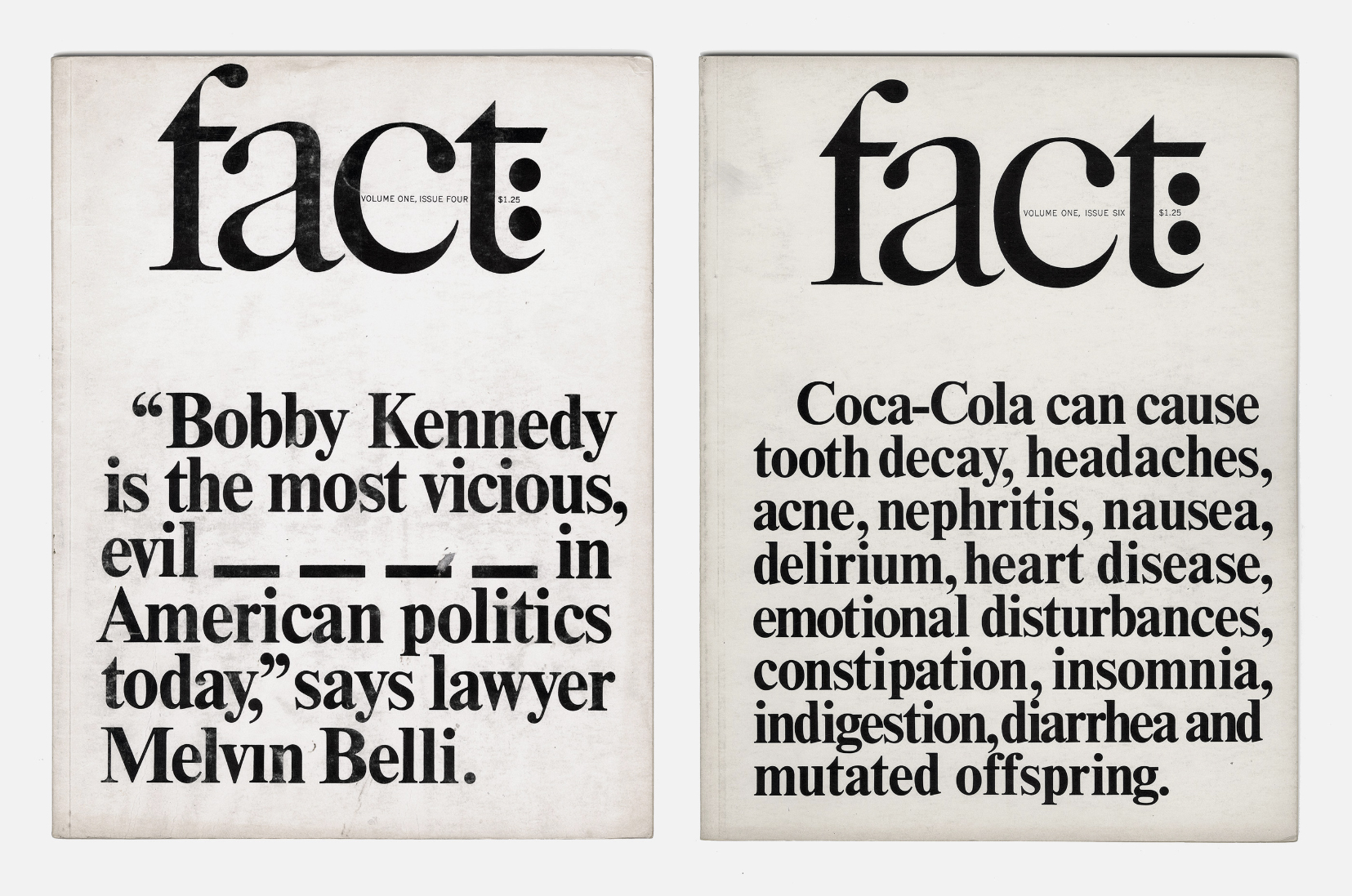
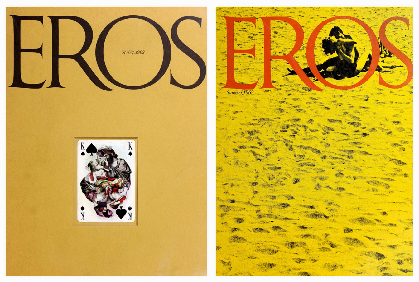
While posting about the Whole Earth Catalog, I thought of Herb Lubalin, a designer who you should all know about when it comes to iconic magazine design, as well as typography, type design, logotype design.

Under a different circumstance, we may have taken a field trip to New York! (I know. I’m sad too.) Every year I take my Intro class to different places depending on what is going on in the City, but The Herb Lubalin Study Center of Design and Typography is definitely on my go-to list.

Luckily, the Center has two amazing websites where you can see and learn more about Lubalin’s work.
lubalin100.com
flatfile.lubalincenter.com

Even better, his iconic magazines Avant Garde, Eros, and Fact are entirely digitized and available for all to see.

See Avant Garde
See Eros
See Fact


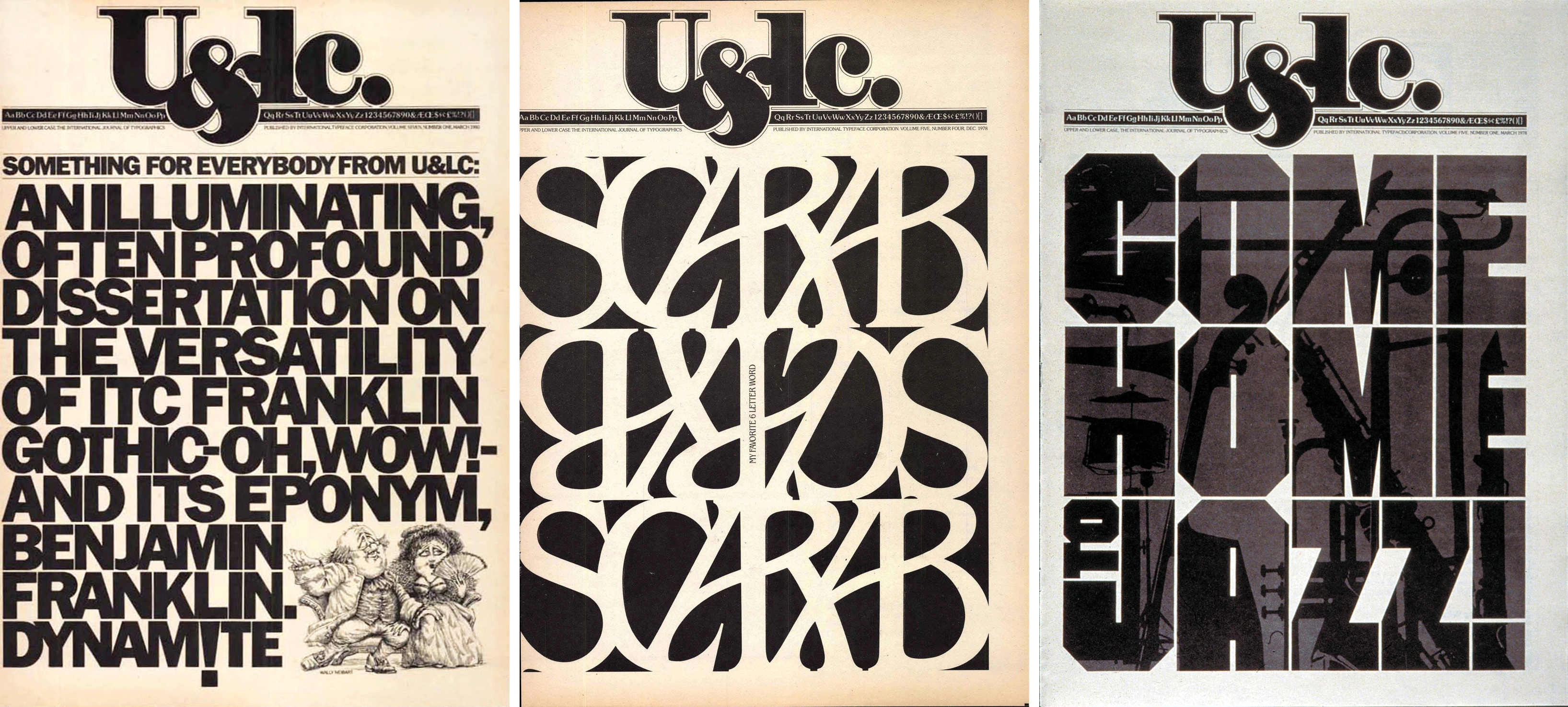
Here’s another magazine he founded and designed, U&lc (Upper and Lower case, the International Journal of Typographics) for the type foundary ITC.

Here you can see the volume 1, number 1, published in 1973.

And here you can learn more about the U&lc.


Lastly, here’s the Lubalin Center‘s director Alexander Tochilovsky telling all the stories behind these magazines. It would have been better if we had visited him and heard this in person, but it’s still pretty great 🙂


The Whole Earth Catalog

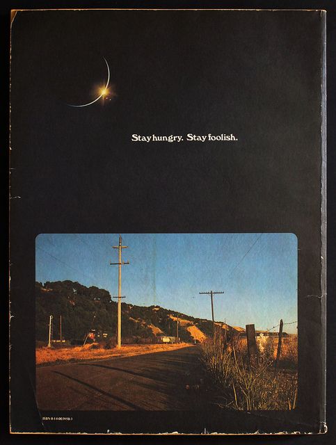
Although I shared these with you during class simply to showcase the contrast in size and the use of negative space, it actually hit me later that you guys may not know about the Whole Earth Catalog! (Did you?) So this magazine is what Steve Jobs called “Google in paperback form, thirty-five years before Google came along” in his 2005 Stanford commencement speech and where the famous “Stay hungry, stay foolish” was borrowed from. To be more exact, from the back cover of the last issue:

The Whole Earth Catalog was founded by Stewart Brand, published between 1968 and 1972,  and it was a lot of things while in the form of a sales catalog: “a how-to manual, a compendium, an enyclopedia, a literary review, an opinionated life guide, and a collection of readers’ recommendations and reviews of everything from computational physics to goat husbandry.” It is “what came to be the magnum opus of the entire counterculture.”

Chris Anderson, the later editor of Wired, explains the Catalog’s “chain of influence”: “The Whole Earth Catalog inspired the Homebrew Computing Club, who inspired Steve Wozniak to build the Apple 2, who inspired the personal computer movement, who in turn inspired the original web. Who inspired the open-source software movement. Who inspired the open-source hardware movement which inspired the maker movement who inspired me.”

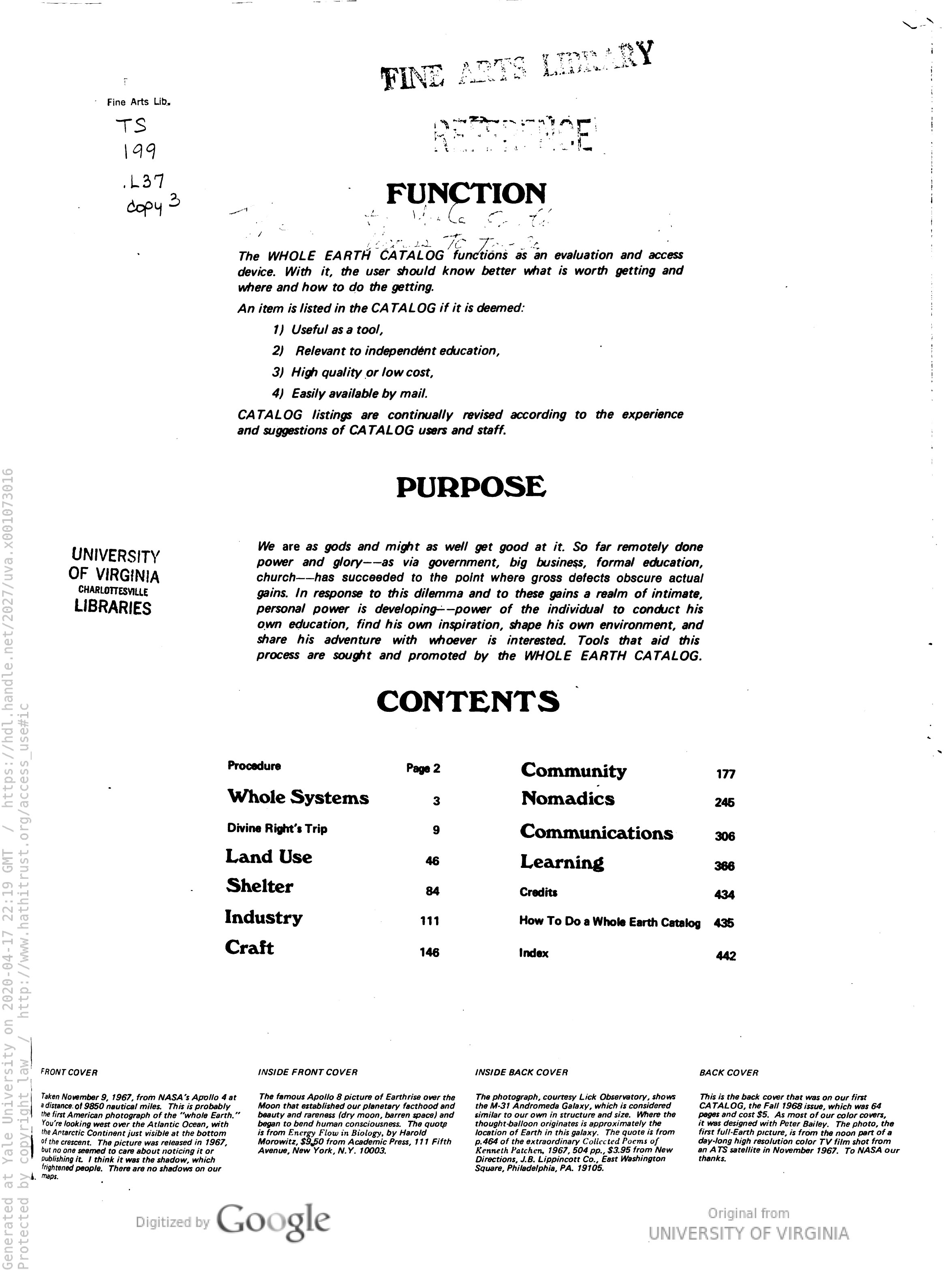
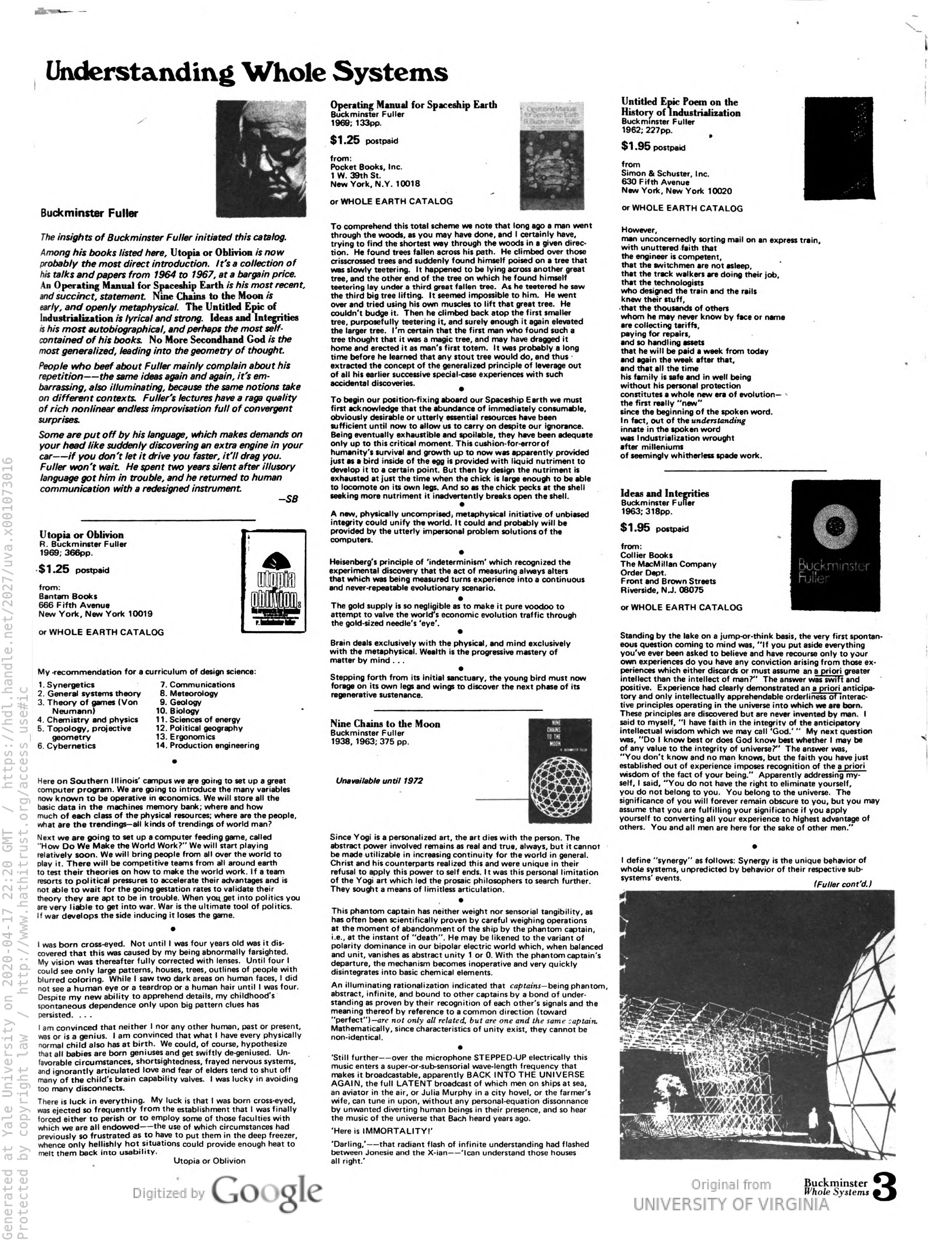
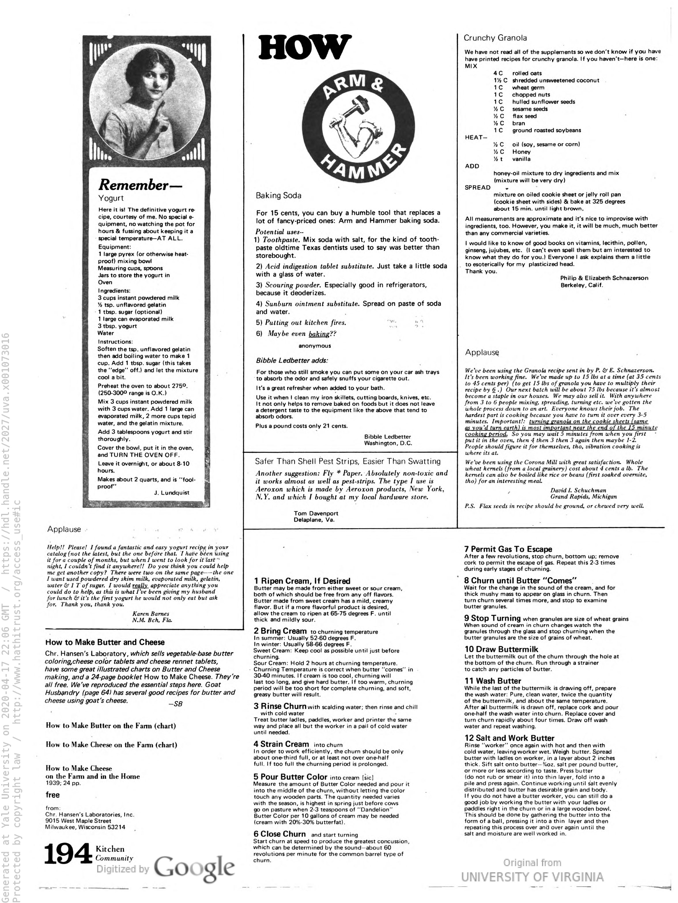
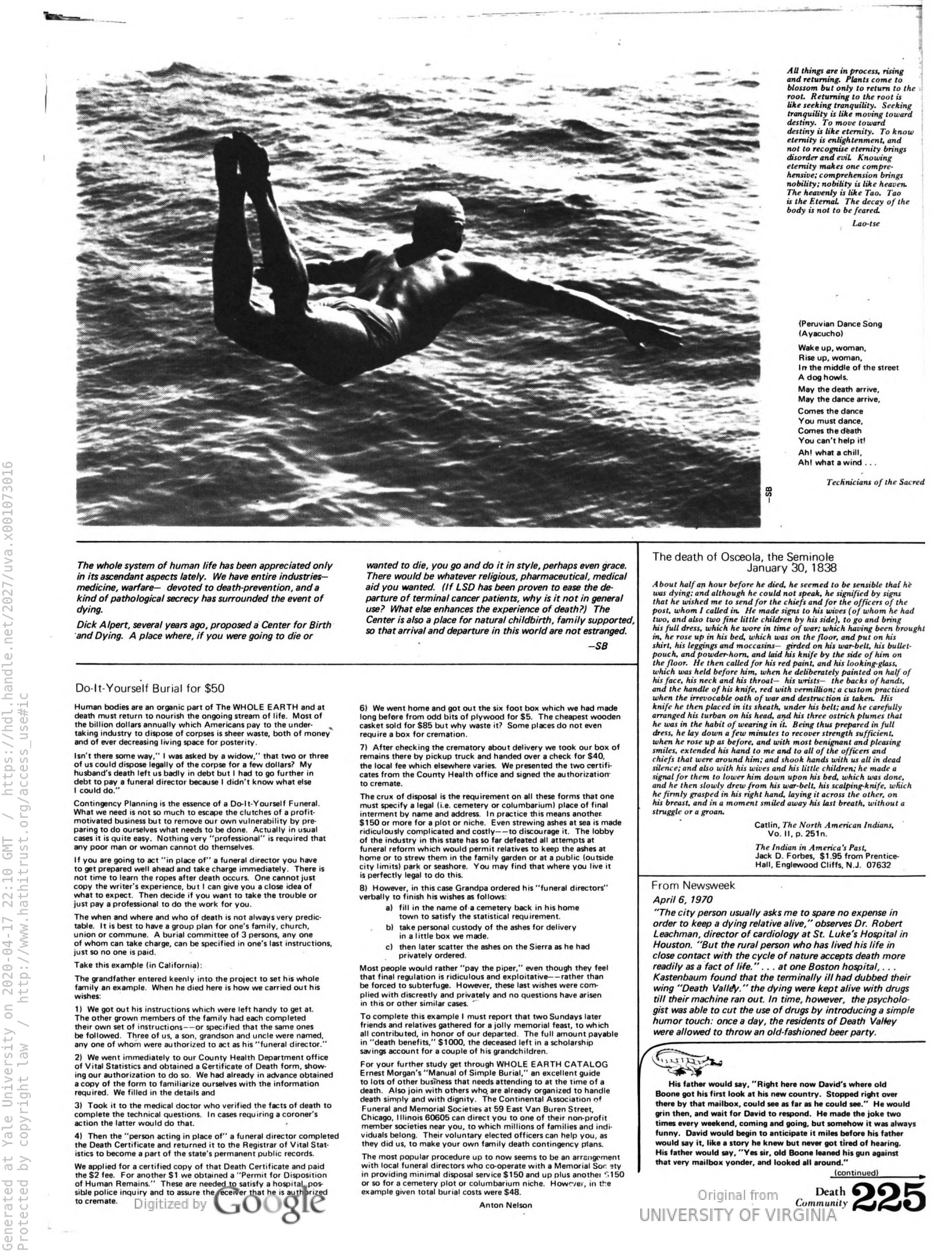
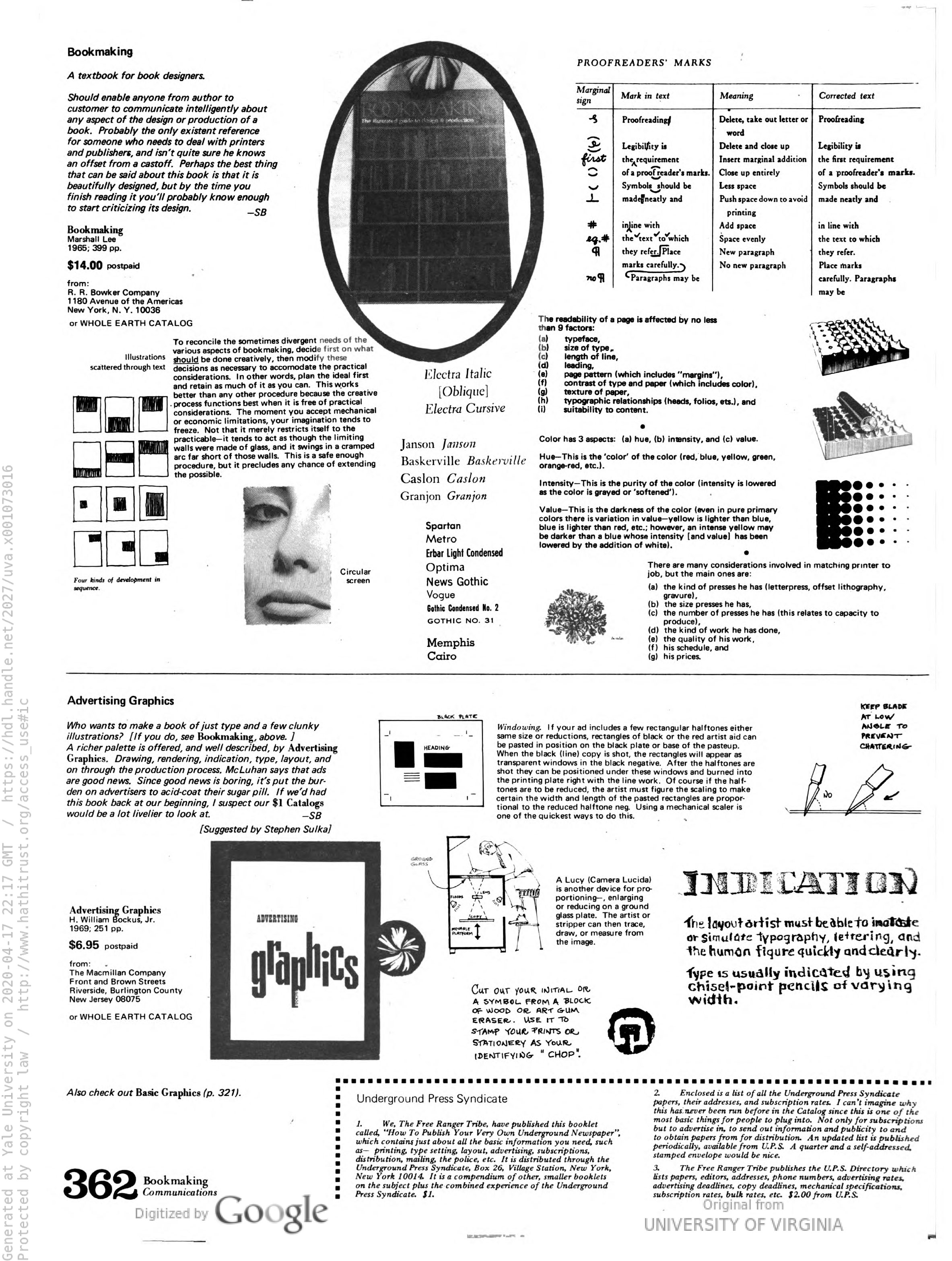
Some pages from the Last Whole Earth Catalog (click to see them bigger):

uva.x001073016-5-1587161982

Notice under purpose: “a realm of intimate, personal power is developing—power of the individual to conduct his own education, find his own inspiration, shape his own environment and share his adventure with whoever is interested.”
Which, I think is what we need more than anything now.

 uva.x001073016-7-1587162052

uva.x001073016-198-1587161219

uva.x001073016-229-1587161412

uva.x001073016-366-1587161822

You can view the entire issue of the Last Whole Earth Catalog through the Yale Library system. You’ll need to log in with your netID. Here!

Read more about Stewart Brand and the Whole Earth Catalog.

theguardian.com/books/2013/may/05/stewart-brand-whole-earth-catalog

newyorker.com/news/letter-from-silicon-valley/the-complicated-legacy-of-stewart-brands-whole-earth-catalog

Saul Bass

Also watch HERE Kyle Cooper (also a title designer of all of these who also went to Yale!) talks about Saul Bass.

Some of his greats that epitomize how typography & imagery work together:

More: Saul Bass title sequences: ten of the best, by the Guardian

Now, take a look at his film posters here, and see how they relate to the moving title sequences. (firstly, you’ll see how things don’t have to be moving to express movement!)

Lastly, read more about his life and work:
aiga.org/medalist-saulbass

A Communications Primer by Charles & Ray Eames (1953)

An instructional film on the basics of communication, created by Charles and Ray Eames of Eames Office for IBM. Music created and composed by Elmer Bernstein.

You can also download the film here: archive.org/details/communications_primer

Also, more about Eames Office: eamesoffice.com

Thinking about the client–designer relationship

A few fun things to see while we are thinking about the client–designer collaborative relationship…

In 1986 Steve Jobs hired Paul Rand, one of the most influential American designers who also taught at Yale School of Art, to design the logo for his NeXT educational computer company. This is how Paul Rand introduced the logo:

and here is Steve Jobs talking about working with Rand:

And if you want see that NeXT logo book: here

To learn more about Paul Rand and his work: paulrand.design

A Primer of Visual Literacy

Hi all, great seeing you today. While we are focusing on learning technical skills and typographic details at this particular moment, I would like you to take a pause and reflect on all the little steps you have taken since the beginning of this semester.

It is easy to forget about the big picture and the fundamentals (like, what exactly is it that I’m doing? And why? And what was this thing called design again?) when you are working on a specific assignment with a specific subject matter, but the good news is that you may(should) have already internalized some of the fundamentals and may be utilizing everything that you’ve learned synchronically, without even thinking about it! (I hope… 🙂 )

As we continue to go further on this journey, I would like you to always remember why you are doing what you are doing and what it all means.

This reading will take you back to the underlying context of what we are doing and give you more examples of various visual strategies—which you may want to try to press against what you are doing with your posters now. Take a read, and if you have any comments or questions, bring to class on Thursday.

An excerpt from A Primer of Visual Literacy, Donis A. Dondis

To Read

Hi all,

here you can review some of the fundamentals of Typography we talked about yesterday:
http://thinkingwithtype.com/text/
Take a look and let me know if you have any questions.