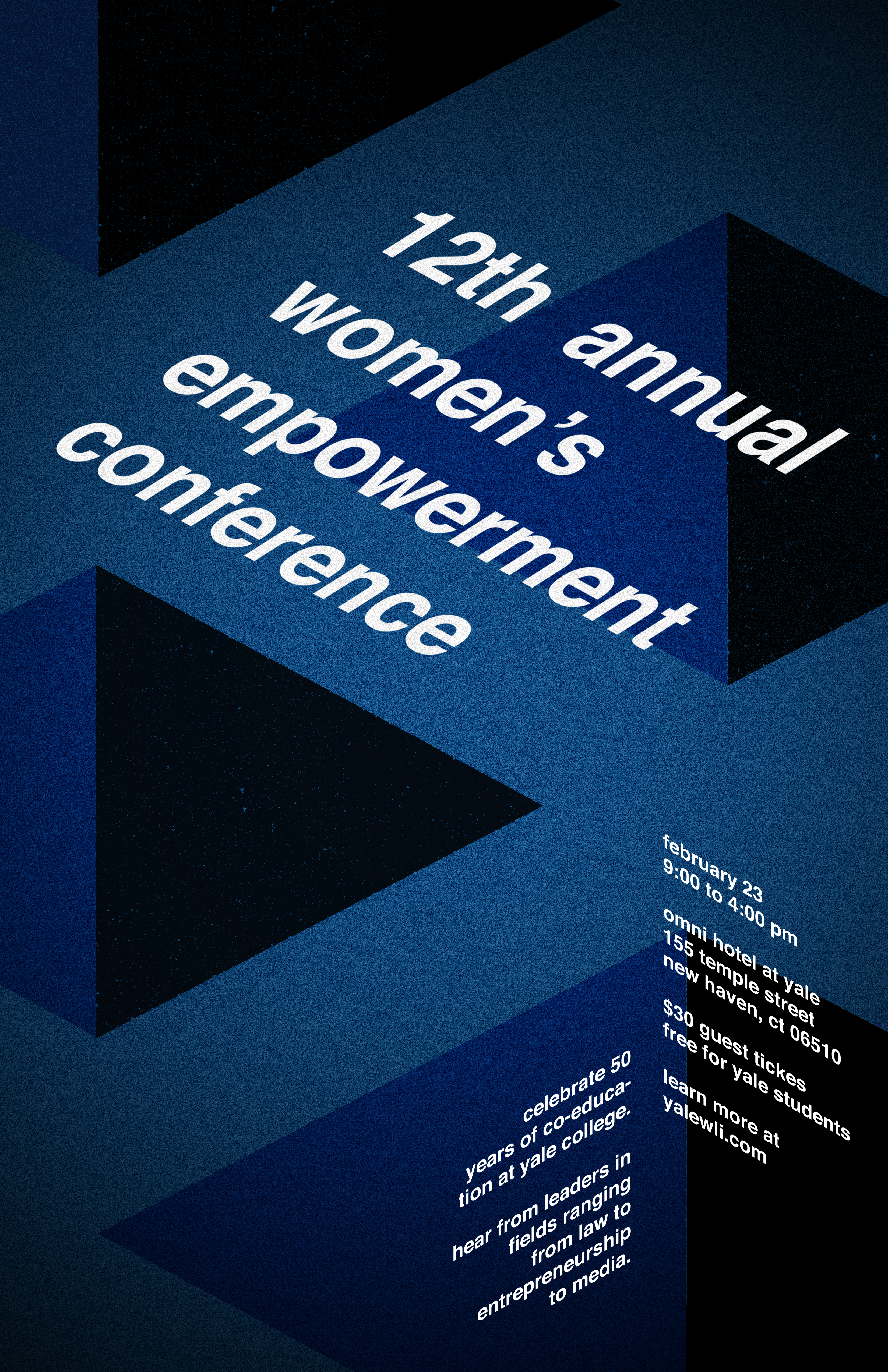
Hey everyone, my brain is fried so this is my (most) final poster yet, but I’m certain there is much room for improvement. I took out the “rays of light” because I think the holes/pyramids and the light were two different ideas trying to communicate the same theme. Instead, it’s just the text *rising* (although subtly), and it’s the lightest thing in the composition (hopefully, some subconscious rising out of the darkness/rising above commentary is sparked). Anyways, that is that!
Author Archives: Zawar Ahmed
anyone else unable to get…
anyone else unable to get into the meeting?
Here’s my Helvetica poster! this…
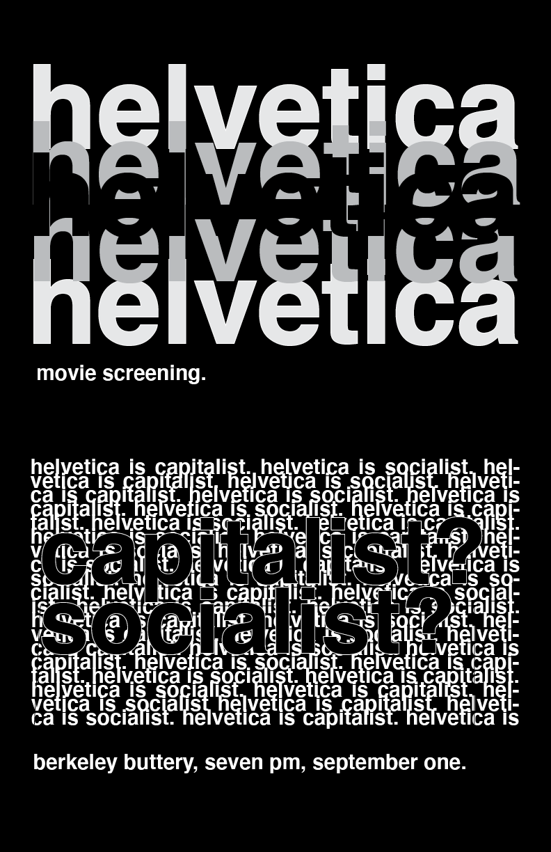
Here’s my Helvetica poster! this was so rough, much harder than I thought it would be :”( my last poster was kind of a scrap so started over from nothing. I used the repetition of the word Helvetica to emphasize how many different opinions/narratives there are around Helvetica. From those different narratives, the one I wanted to focus on was whether it’s capitalist or socialist (hence the focus on those words within that ocean of text). I experimented with both a white background version of this with inverted colors and the one you see now. I settled on the black one because it gives it more of the ominous/underground feel I was going for + I feel like it’s more legible. Please tell me how to fix this <3 (had some mishaps w indesign that I didn't know how to fix, can we pretend those don't exist?) #project3.2
i’ve attached my updated Word…
i’ve attached my updated Word poster. not sure how to do it right but hopefully this works

