Posts by ct.dunn

Keyboard Shortcuts | Hide comment threads

AESY Poster for Rosa V2
AESY Poster for Rosa

Hi Corey! I really enjoy these posters, particularly the second one 🙂 A couple of suggestions: While I do like the eye-catching use of numerous neon text bubbles I was hoping if you could try to create a different rendition with a calmer/sincere atmosphere/visual elements? I know while “a Rant” is often thought of as a loud ramble of words, I think the exhibition meant to showcase all forms of communicating pent up emotions (sad, nostalgic, angry, happy, disappointed) through artworks which would create a more serious tone. Also, the poster seem to convey the event to be performance-esque, especially since “Rant” is often dynamic and requires an audience, so if you could mention it to be an art showcase somewhere that would be great. Lastly, I would watch out for the capitalization of texts in the second poster! Thanks again for your hard work! It was lovely to see your take on the prompt for the first time.

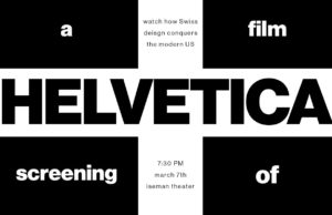
Helvetica Poster Redesign

#Project3.2

Hi guys, I apologize for the bit of a late upload, but here is my Helvetica poster redesign! I ultimately decided to utilize the white(black) space within the swiss flag more in this design and balanced the rest of the text above and below the title of the movie. I had to finagle the upload a little because for some reason the png version of this file would not copy over correctly and the HELVETICA wouldn’t be centered. Thanks to you all!


Hi! I love how this redesign incorporates the logistical aspects of what the event is with more of your imagery/concept in a very cohesive way. They fit together very nicely, and the Swiss influence definitely comes across.

Stay Safe Y’all and Poster Upload

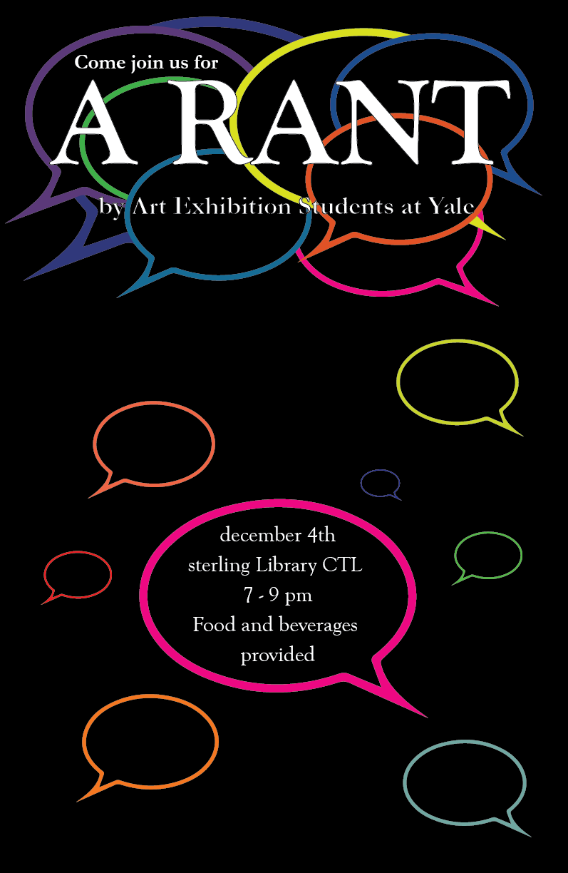
coreydunn-Monologue Poster Redesign

Hello everyone! Let’s make the best of this situation :P. Here’s my poster.
#project3.1

I really like the top half of this poster! The changes you made were immediately apparent and I love the way the title slants against the diagonal of the “A.” The readability is great and I immediately know what’s going on. To an extent, I think the very bottom line and the thick bold is fine but it is very eyecatching to a detail that might not be super important. I was wondering how you chose to space the information in the center, especially the block on the right, as that seems like very important stuff that hasn’t been given enough significance.