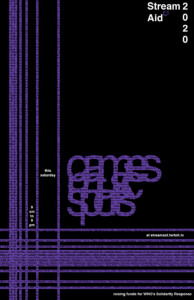
Hi everyone! I made quite a few changes to the previous version of my client poster. I hope this reflects better the coming together of distinct communities, which I believe is the most prominent feature of the stream aid.

Hi everyone! I made quite a few changes to the previous version of my client poster. I hope this reflects better the coming together of distinct communities, which I believe is the most prominent feature of the stream aid.

Hi everyone! This is the revised version for my Helvetica poster. The feedback I received on the original version made me realize that the frame was indeed not big enough. However, after increasing the size of the text framing the poster I struggled with continuing to emphasize the title in the way I wanted. Increasing the size of the text framing the poster reduced a lot of the negative space around the title, which forced me to find new ways to bring more focus to the title. In an attempt to increase legibility, I also tried following some of the suggestions I had received such as removing the letter in the middle instead of the a in the end or removing the first letter instead of the last one. Those changes, however, did not work as well for me in alluding to the deficiencies and loose ends in contrast to the stable and widespread characteristics of Helvetica presented in the movie. In the end, this was my favorite setup from the spreads I had on my InDesign document. :)))