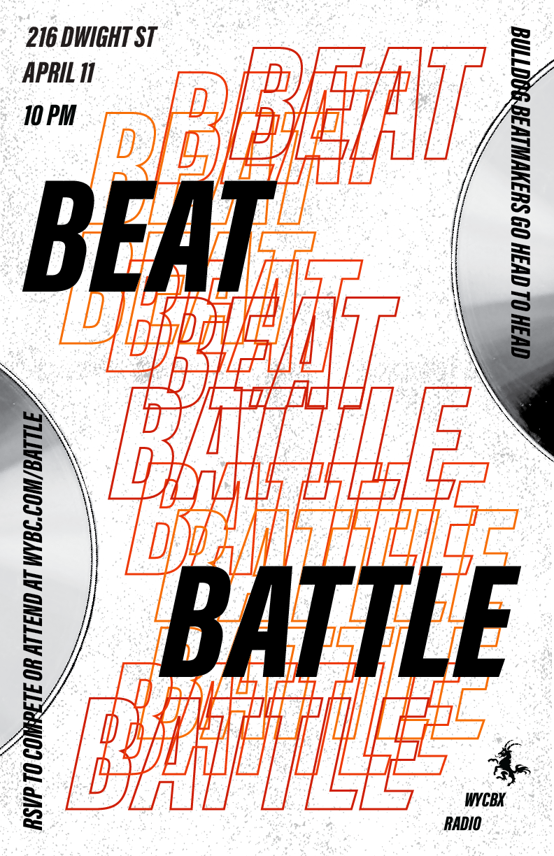
Here’s my final poster! It’s not too different from the revised version I showed in class, I just played a bit with the spacing of the “echoes” and fixed up the margins using the box suggestion people gave in class. I looked at making more echoes that bled off the page, but in the end, I felt like it looked a little too messy and busy. Excited to hear what you all think!
Author Archives: annakane
This is my redesigned poster….
This is my redesigned poster. Taking the feedback that my last poster was too ominous/scary, I decided to focus on the ubiquity of the typeface here (which can be interpreted as ominous or comforting, depending on how the viewer feels about uniformity). After spending hours in Indesign, it feels a little silly to be choosing such a simple design, but I like that this version isn’t too busy or distracting, allowing the repetition of the letters to be the dominant design feature. Please let me know what you think!
Hoping you’re all doing well (:

