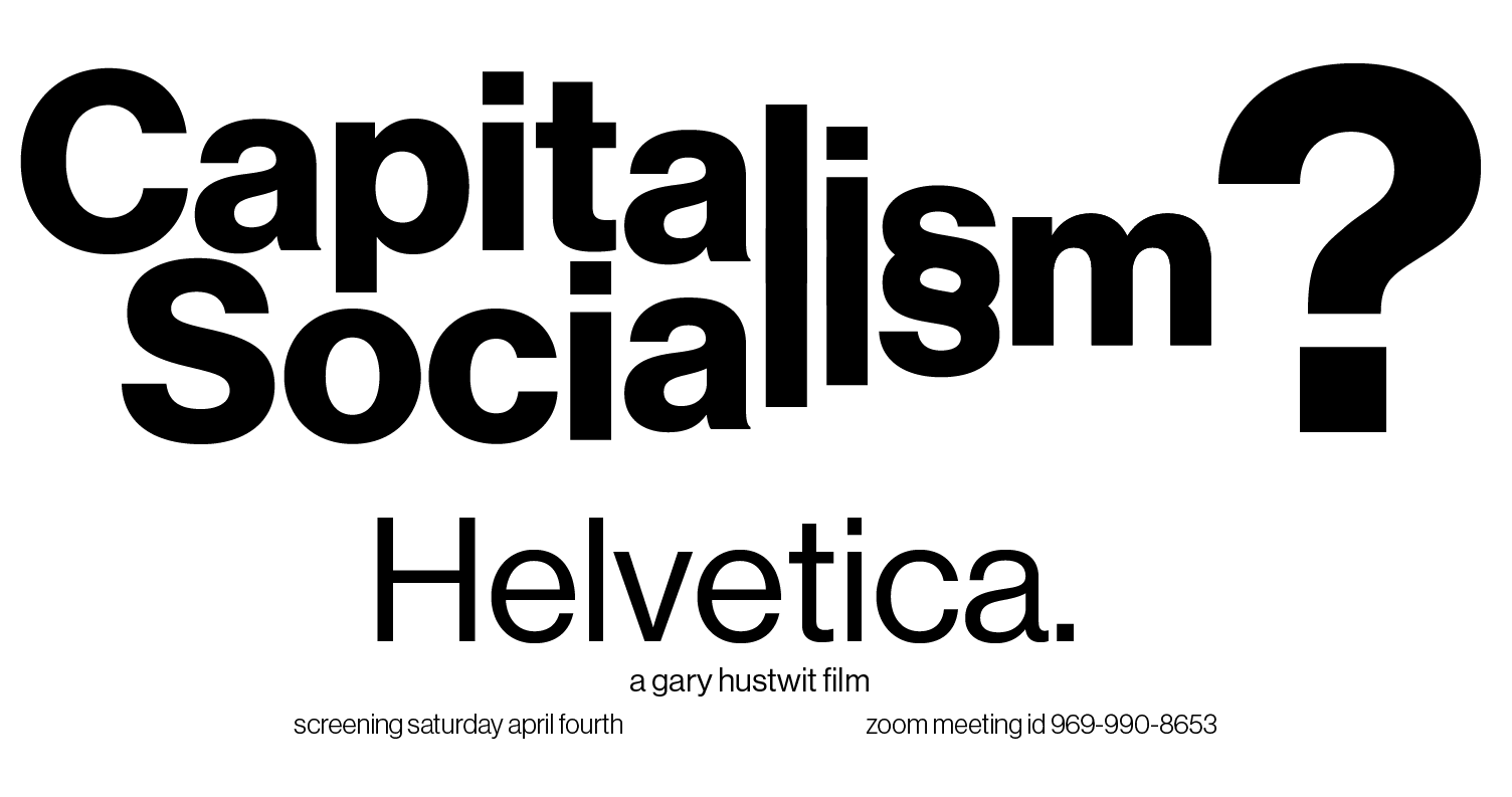
Re-updated Helvetica poster. Did my best to take into account much of the critiques from last class. I’m a little concerned that I may have reverted to some of the issues I had before, namely that the poster is segmented into two sections, but I think it works here and that it gives off the look of a movie poster, which helps communicate what the event is.
