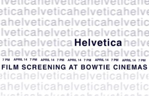
hi! for some reason, I can’t upload an image larger than this and I’ve tried many many times, so I also attached a PDF that hopefully has a better quality version of the poster. I struggled a lot with getting relevant information to be a part of the image so I would love feedback on that! thanks
I LOVE this redesign!! You managed to create the same framing effect as your original sign without any representational elements, and (in my opinion) it draws the eye to the title and info much more effectively. I can tell that you paid close attention to capitalization, and the information strip is distinguishable from the “helveticahelvetica….” because of the difference in letter shape (cap/no-cap). The single capital “H” in the sea of blurry helveticas is really spooky to me, and seems to speak to the omnipresence of helvetica in the world today. Great edit!!