This is my redesigned poster….

helvetica poster 2

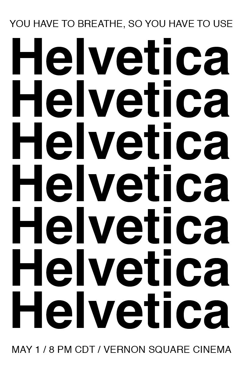
This is my redesigned poster. Taking the feedback that my last poster was too ominous/scary, I decided to focus on the ubiquity of the typeface here (which can be interpreted as ominous or comforting, depending on how the viewer feels about uniformity). After spending hours in Indesign, it feels a little silly to be choosing such a simple design, but I like that this version isn’t too busy or distracting, allowing the repetition of the letters to be the dominant design feature. Please let me know what you think!

Hoping you’re all doing well (:

#project3.2

I love this poster a lot and I think its simplicity is part of its charm. I don’t think there’s much that could make it better, and the elegance highlights how nice the quote sounds. There isn’t any information lost, there aren’t too many distracting elements, and if I saw this hanging on a wall, I would definitely be intrigued/stop to read. The near symmetry is also attractive.

Nice poster! I wonder if there would be a different way to separate the information without using the “/”? Maybe with spacing? Also, I’m questioning the reasoning behind the usage of all upper case.