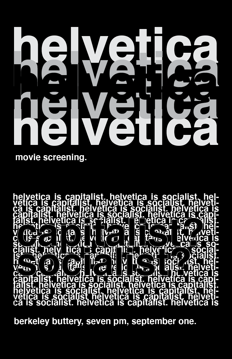
Here’s my Helvetica poster! this was so rough, much harder than I thought it would be :”( my last poster was kind of a scrap so started over from nothing. I used the repetition of the word Helvetica to emphasize how many different opinions/narratives there are around Helvetica. From those different narratives, the one I wanted to focus on was whether it’s capitalist or socialist (hence the focus on those words within that ocean of text). I experimented with both a white background version of this with inverted colors and the one you see now. I settled on the black one because it gives it more of the ominous/underground feel I was going for + I feel like it’s more legible. Please tell me how to fix this <3 (had some mishaps w indesign that I didn't know how to fix, can we pretend those don't exist?) #project3.2
