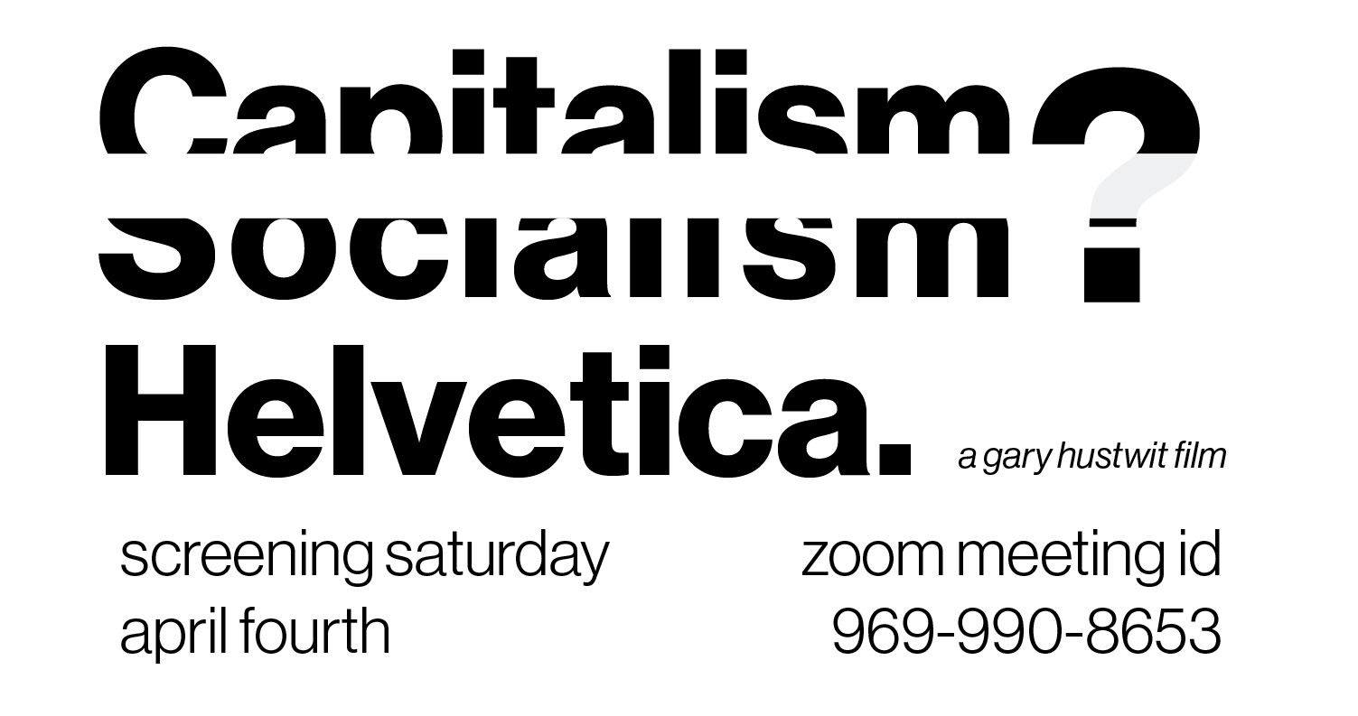
Did my best to take into account much of the advice I got last time – tried to make it “feel like Helvetica” and did my best to make the question mark more readable. According to Prof. Choi’s advice, I put it in landscape so as to make it more cohesive, instead of having two sections in the upper and lower half. I’m curious if you all think these changes were effective.
